Blender Grease Pencil: Achieving That Perfect Lo-fi Shading
🧐 Ever feel like your Blender scenes lack that ‘oomph’ despite meticulous setup?
 There’s often a subtle disconnect between following tutorials and achieving that truly polished, professional look. For Lo-fi aesthetic animations, the right shading and lighting can make or break the mood. Many artists struggle with getting shadows to feel intentional and colors to pop without looking overdone. Turns out, the fix is often in understanding how light interacts with your specific material setup and leveraging procedural tools for greater control.
💡 Three Core Principles for Captivating Lo-fi Shading in Blender
1. Mastering Light and Shadow for Depth
The sun’s position and intensity are crucial. Instead of just placing a light, think about how it interacts with environmental elements like window blinds. Adjusting the sun’s rotation and controlling shadow softness (disabling Soft Shadow can create more decisive lines) fundamentally changes the scene’s mood. For instance, adjusting the blind’s height from ‘too high’ to ‘3’ and the shadow bias to ‘5.50’ can dramatically alter how light falls on surfaces, adding naturalistic detail.
2. Procedural Texturing for Unique Materials
Don’t rely solely on flat colors. Utilizing Voronoi Texture and Gradient Texture nodes within the Shading tab allows for procedural generation of patterns and subtle variations on surfaces like the washing machine. Experimenting with Smooth F1 on Voronoi and adjusting the Scale (e.g., to 10) creates unique, non-uniform textures. This approach is key to avoiding repetitive looks and achieving a hand-crafted feel, even in complex objects.
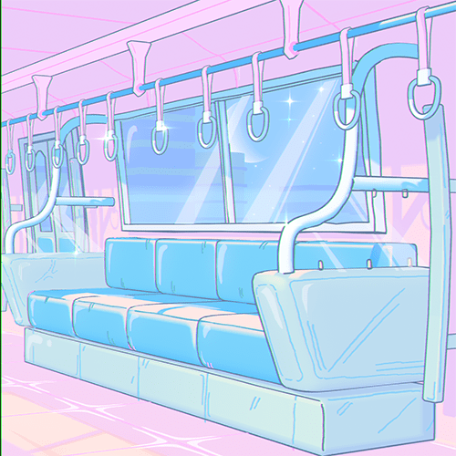
3. Strategic Color Palettes for Cohesion
The overall environment color impacts all materials. Changing the wall color from a default dark to a warm orange or peach provides a better base for other elements. Within materials, using a Color Ramp with multiple stops (base, middle, accent, shadow colors) offers granular control. For the washing machine, a pink palette with blue accents, or for the sofa, a transition from light blue to darker blue, can create visual interest and hierarchy. Remember to use the HSV color model for easier adjustments and consider accent colors making up around 20% of the total palette.
🛠️ Key Skills & Details That Define Professional Quality
The journey from a flat render to a captivating Lo-fi animation involves more than just selecting tools; it’s about understanding their application.
- Intentional Lighting Setup: Instead of simply placing a light, 3D Artist EmesZack emphasizes setting up a primary light source, like the sun, and observing its interaction with scene elements. The rotation of the sun object dictates the direction of light, while properties like Shadow Bias and disabling Soft Shadow fine-tune shadow crispness. Adjusting these parameters based on the desired mood is a hallmark of professional lighting.
- Node-Based Material Creation: For materials like the washing machine, employing a node group that combines Shader to RGB, Color Ramp, Mix RGB, and Voronoi Texture provides immense flexibility. This allows for generating subtle surface imperfections and detailed patterns. The ability to switch Color Ramp interpolation from Linear to Constant or B-Spline offers distinct stylistic outcomes.
- Color Theory in Practice: Applying color is not arbitrary. The course demonstrates how to establish a base environment color (e.g., a warm, peachy tone for walls) that complements other objects. Then, within individual materials, using a Color Ramp with multiple color stops allows for defining a clear hierarchy: a main color, a mid-tone, an accent color, and a shadow color. This systematic approach ensures visual harmony and prevents colors from clashing.
- Material Linking and Copying: To maintain consistency and efficiency, understanding when to Link Materials (Ctrl+L) versus creating a New Copy of Material is vital. Linking materials ensures all instances of an object share the same properties, simplifying global changes. Creating a copy allows for unique variations on a base material, as seen when differentiating the sofa cushions from the main sofa body.
💬 Frequently Asked Questions
Q. As a 3D Artist, how can I achieve a more ‘painterly’ look with Blender’s Grease Pencil?
A. The key lies in mastering the Color Ramp node and its interpolation modes. Experimenting with Constant interpolation can give sharper, more defined color blocks, mimicking a painted style. Combining this with strategically placed gradients and a well-chosen color palette, aiming for a balance between warm and cool tones, will significantly enhance the painterly effect.
Q. What’s the most efficient way for a 3D Artist to add detail to an object like a washing machine in Blender without manual modeling for every bit of texture?
A. Leverage procedural textures. By connecting Voronoi Texture and Gradient Texture nodes within the Shading tab and feeding them into a Color Ramp or Mix RGB node, you can generate complex, organic patterns. Adjusting parameters like Scale, Detail, and Distortion on the Voronoi Texture, and changing its Function Type (e.g., to Smooth F1), allows for a wide variety of unique surface details that appear hand-crafted but are generated procedurally.
Q. How can a 3D Artist ensure consistent Lo-fi aesthetics across multiple objects in a scene?
A. Establish a core color palette for the environment first, then apply it thoughtfully to each object. Use the Color Ramp node with a limited number of color stops (typically 3-4: base, accent, highlight, shadow). When applying materials to similar objects or components (like different parts of a sofa), use Link Materials (Ctrl+L) to ensure consistency. For variations, make a copy of the material before making adjustments. Pay close attention to how lighting interacts with each material to maintain the overall Lo-fi mood.