Mastering Realistic Character Coloring: Gatan’s Essential Techniques
🎨 When Your Colors Just Don’t Pop: Bridging the Gap from Flat to Fantastic
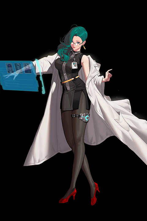 The struggle to achieve that professional depth and vibrancy in your digital art is real. You follow the tutorials, you layer your colors, yet something feels missing… like they’re not quite alive. The culprit is often a subtle misunderstanding of light, shadow, and material interaction. This isn’t about complex brushes; it’s about fundamental principles.
💡 The Gatan Method: Elevating Your Coloring Game
1. The Mid-Tone Advantage: Building Form, Not Just Color
The key to believable form lies in your mid-tones. Instead of thinking of color as flat blocks, visualize them as transitional states between light and shadow. This means carefully considering how light wraps around forms. For clothing, think about fabric folds not just as lines, but as subtle shifts in value and hue that react to light. A common pitfall is making mid-tones too saturated or too dark, which flattens the image. Experiment with a subtle shift towards the shadow color or a slightly desaturated version of the base color to create that crucial sense of volume.
2. Material Language: Beyond Basic Textures
Every material has its own way of reflecting and absorbing light. For instance, smooth metal behaves very differently from rough cloth or soft skin. The trick is to observe and replicate these subtle interactions. Instead of just picking a color, consider the material’s properties. Is it glossy, matte, translucent, or rough? This influences the sharpness of your highlights, the softness of your shadows, and the overall color cast. Understanding this ‘material language’ is what turns a good illustration into a great one.
3. The Power of “Finishing Touches”: Refinement is Key
After the main coloring is done, the real magic happens in the refinement stage. This isn’t about adding more detail arbitrarily; it’s about enhancing what’s already there. Focus on subtle adjustments to light direction, color temperature shifts, and edge control. For example, carefully placed highlights can define form and add a sense of shine, while slightly softening certain edges can help elements recede into the background, creating depth. This stage is crucial for unifying the piece and giving it that polished, professional look.
🛠️ Key Skills & Details That Define Professional Quality
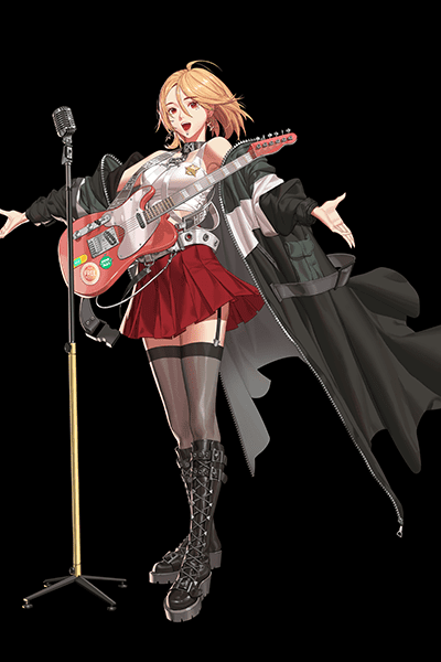
Achieving a professional finish involves more than just knowing software tools. It’s about developing a keen eye for light and color, and understanding how they interact with different surfaces.
- Mastering Light and Shadow: Professionals don’t just slap on darks and lights. They understand light sources, color temperature shifts in light and shadow, and how ambient light affects the overall mood. This involves analyzing how light falls on different forms and materials, creating subtle gradations that add depth and realism.
- Materiality in Color: Each surface—be it skin, fabric, metal, or hair—interacts with light uniquely. Understanding these properties allows for more convincing textures and finishes. This means paying attention to specular highlights, subsurface scattering (especially for skin), and how different materials absorb or reflect ambient light.
- Strategic Detail and Edges: Not all details need to be sharp. Professionals learn to control edge hardness to guide the viewer’s eye and define form. Areas in sharp focus might have crisp edges and strong highlights, while areas meant to recede might have softer edges and more muted tones. This control is vital for creating a sense of depth and directing attention.
- Color Harmony and Mood: The final color palette is crucial for setting the mood and ensuring visual harmony. This involves understanding color theory not just academically, but practically – how to choose palettes that evoke specific emotions and how to ensure all elements in the illustration work together cohesively.
💬 Frequently Asked Questions
Q. Illustrator Gatan, what are the most common mistakes beginners make when trying to add mid-tones?
Illustrator Gatan observes that beginners often treat mid-tones as just another flat color, failing to connect them to the interplay of light and shadow. A common error is making them too dark or too saturated, which can flatten the form instead of defining it. Focusing on subtle value shifts and considering the direction of light is crucial for creating a sense of volume.
Q. Illustrator Gatan, how can I better represent different material types in my illustrations?
Illustrator Gatan emphasizes understanding the unique way each material interacts with light. For instance, glossy surfaces will have sharp, bright highlights, while matte surfaces will have softer, broader reflections. Considering the material’s texture, reflectivity, and color absorption helps in choosing appropriate colors and rendering techniques, making your illustrations more believable.
Q. Illustrator Gatan, what is the most important tip for achieving a polished finish in my digital artwork?
Illustrator Gatan stresses the significance of the “finishing touches” stage. This involves refining light and shadow, adjusting color temperatures, and strategically softening or sharpening edges. These final adjustments are what elevate an illustration from good to professional, unifying the elements and enhancing the overall depth and visual impact.