Package Design: Why Your Labels Look Off and How to Fix It
🧐 That Frustrating Moment When Your Design Just Doesn’t Print Right
You meticulously craft every detail, but the final printed product still misses the mark. It’s a common design pitfall – that elusive gap between digital perfection and tangible reality. Often, the issue isn’t a lack of skill, but a misunderstanding of crucial pre-press and application steps. This guide breaks down the expert process to ensure your package designs translate flawlessly from screen to shelf.
💡 3 Pro Tips to Elevate Your Package Design Workflow
1. Mastering the Print Data: Beyond the Visuals
The script emphasizes the critical need to prepare your “print data” meticulously. This involves more than just setting up your artwork.
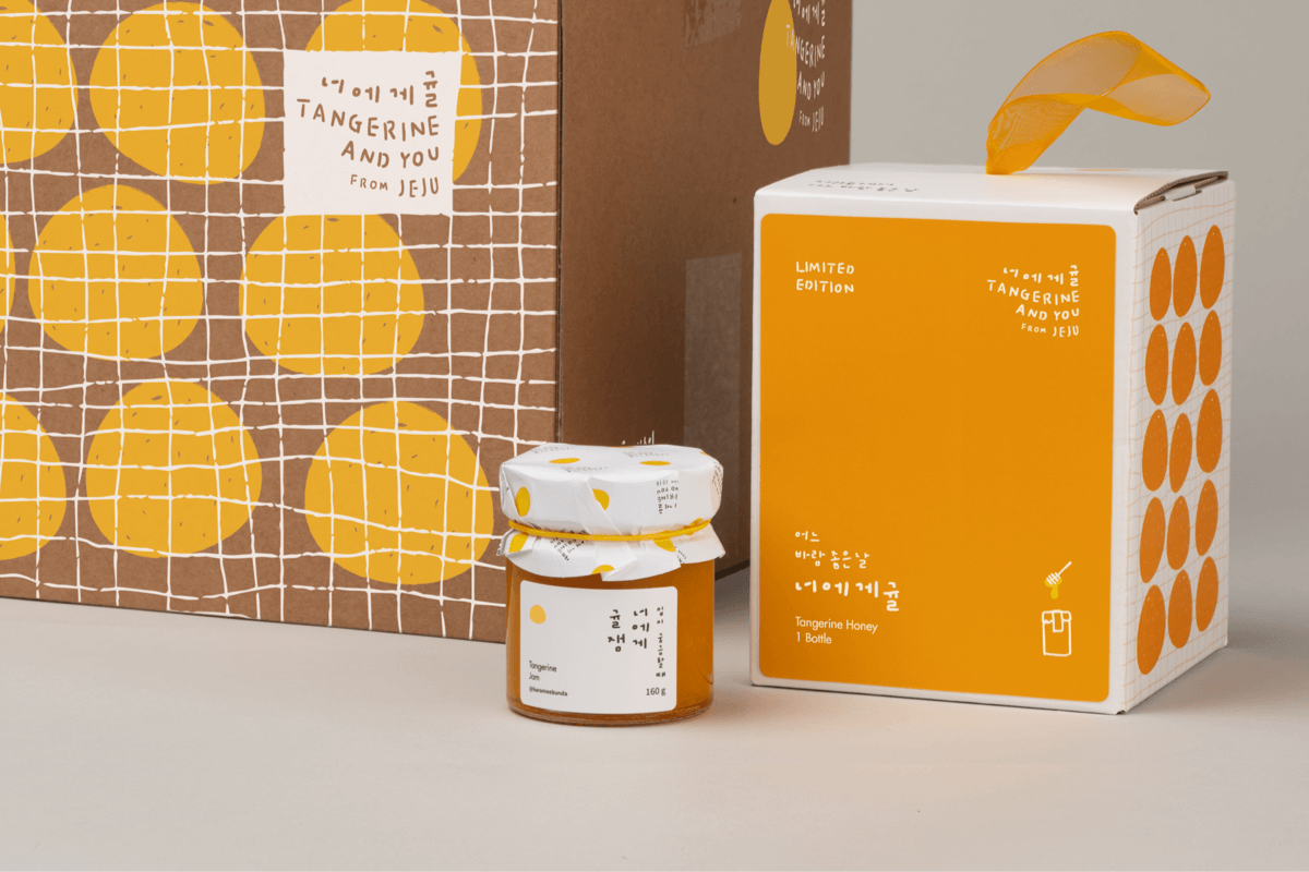
- Knife Lines & Margins: Accurately defining these is paramount. For instance, adding a 2mm margin all around your label design is standard practice. Remember that the final dimensions, like 189mm, are adjusted based on these margins, not just the original artwork size. This ensures no crucial design elements are lost or misaligned during cutting.
- Spot Colors & Color Chips: When using spot colors for specific finishes like gold foil or special coatings, creating dedicated color chips is essential. This ensures the print shop can accurately reproduce your intended hues and effects, especially for background colors where you might layer a spot color with CMYK.
- Post-Processing Layers: Separate layers for effects like gold foil, gloss coatings, or transparency are crucial. For example, removing the gold foil layer before generating the main print data, while keeping the glossy coating layer (which is printed), ensures accurate production. Marking these specific areas with a distinct color (like magenta) for the print shop is also a vital communication step.
2. Box Structure & Visual Hierarchy: Designing for Form and Function
The shape of the product itself should inform the packaging structure. For bottles that narrow upwards, an envelope-style box that mirrors this form creates a more cohesive and appealing presentation.
- Structural Design: Utilize provided structure files as a base. This saves significant time and ensures structural integrity. When adapting these, consider how the design elements will wrap around the form.
- Visual Hierarchy: Organizing design elements on the box sides like a poster is a smart approach. For instance, dedicating space for the Korean product name, main ingredients, and premium labeling (e.g., “nonalcoholic,” “sparkling”) ensures clarity and communicates key information effectively.
- Pattern Application: When scaling patterns for the sides of a box, ensuring the pattern’s scale matches the overall design aesthetic is key. Stretching and precisely cutting patterns to fit the box sides, while strategically deciding whether to apply patterns to the bottom (often cleaner without), demonstrates thoughtful execution.
3. The Mockup Magic: Bringing Your Design to Life Realistically
Mockups are where your design truly gets its first physical impression. Professionals pay close attention to detail here to simulate the final product accurately.
- Layer Management: Keep your design elements organized. For instance, creating a dedicated “PTP Design Probiotics” layer and grouping it under a “PTP” folder is good practice. This allows for easy color changes and adjustments, such as setting the PTP layer to “Multiply” to affect the background color.
- Realistic Textures & Effects: Don’t just apply a flat color for metallic finishes. For gold foil, paste it as a realistic texture and use clipping masks to apply it only to the desired areas. Adjusting the degree of texture and using an imported image of gold can significantly enhance realism.
- Color Matching: Precisely matching colors between different packaging components (like the box and its label) is crucial. Copying color codes and applying them consistently, then using the “Multiply” blending mode, helps achieve a unified look. Remember to adjust for different product variations (e.g., probiotics vs. multivitamins) by referencing the correct index for color layers.
🛠️ Key Skills & Details That Define Professional Quality
Translating a design from concept to a printable file requires a deep understanding of how printing processes and materials affect the final output. Professionals go beyond basic software functions, focusing on techniques that ensure quality and efficiency.
- Precise Layering for Finishes: For special effects like gold foil or embossing, creating separate layers is non-negotiable. This allows for precise control over application areas, blend modes, and transparency, ensuring these premium finishes are applied exactly where intended. This includes isolating elements like logotypes for transparency effects or marking specific areas for hot stamping with spot colors.
- Understanding Die-Lines and Bleeds: The “knife line” is the actual cut line, and design elements must extend beyond this (bleed) to avoid unwanted white edges after cutting. Adding margins for labels and understanding how these affect the final dimensions (e.g., 185mm vs. 189mm) is fundamental. Professionals meticulously check these measurements to prevent costly errors.
- Mockup Realism Through Textures and Color: Achieving a convincing mockup involves more than just pasting artwork. Applying textures that mimic real-world materials (like gold leaf) and accurately matching colors across different package components using precise color codes and blend modes (like Multiply) are critical. Adjusting transparency and using clipping masks with imported texture images are advanced techniques that professionals employ to achieve a solid, realistic result.
- Structural Awareness in Design: The form of the product dictates the packaging. For bottles with a tapering shape, designing a box that complements this form, rather than a simple rectangular prism, enhances the user experience and brand perception. This involves understanding how flat structural designs translate into three-dimensional forms.
💬 Frequently Asked Questions
Q. As a Graphic Designer, how do I ensure my label designs are correctly sized for printing and avoid errors with margins?
Graphic Designer Tip: Always add a specific margin (commonly 2mm all around) to your design. Then, adjust the final dimensions based on this margin. For example, if your base artwork is 185mm, but you add 4mm total for margins, your final print dimension becomes 189mm. Double-check the print preview against the specified cut lines (knife lines) to confirm the layout is correct before sending it to print.
Q. As a Graphic Designer, what’s the best way to prepare artwork for special printing finishes like gold foil or spot UV coating?
Graphic Designer Tip: Create separate layers for each special finish. Mark the areas for gold foil or spot UV with a solid, distinct color (like magenta or a specific spot color) on a dedicated layer. This layer acts as a guide for the printer, ensuring they know precisely where to apply these effects. Remove the gold foil layer from your main CMYK print data but keep the spot color layer for the printer.
Q. As a Graphic Designer, I’m struggling to make my package mockups look realistic. What’s a common mistake and how can I fix it?
Graphic Designer Tip: A frequent issue is applying flat colors or simple gradients for metallic effects. To achieve realism, import actual textures (like a gold leaf image) and use clipping masks or layer masks to apply them precisely to the desired design elements. Experiment with different blend modes and opacity settings for these texture layers to simulate realistic depth and shine.
👉 Want to Go Deeper?
Explore the comprehensive techniques used by industry professionals to bring their packaging visions to life.