💡 3 Core Principles for Professional Comic Page Creation
1. Visualize Early, Refine Later: The Power of Thumbnailing
The foundation of a compelling comic page lies in its initial thumbnails. Illustrator Anand Ramcheron emphasizes treating these rough sketches as crucial planning stages. Don’t just sketch panels; use them to map out page flow, composition, and even camera angles. This early visualization is not about perfect detail, but about establishing a strong visual narrative that guides the reader’s eye. It’s not just about learning the technique — it’s about shifting how you think about the page as a sequence of moments.
2. Strategic Inking: Controlling Lines for Clarity and Impact
Ramcheron highlights that effective inking goes beyond just making lines look good. It’s about purposeful linework variation to define form, create depth, and guide attention. This involves understanding when to use technical, precise lines versus more organic, expressive ones. A key workflow tip is efficient line control; practice consistent pressure and stroke variation to build confidence. Mastering the use of “blacks” — solid areas of ink — is critical for directing the viewer’s gaze and adding visual weight where it matters most.
3. The “Blacks” & Halftone Advantage: Elevating Page Dynamics
A pro-level touch often comes down to the subtle use of value. Ramcheron’s expertise includes using “blacks” not just as shading, but as a deliberate compositional tool to draw the reader’s eye to key elements. Furthermore, understanding halftones and how different gray values can enhance mood and clarity is a game-changer. Experimenting with screentones, even digitally, can add a professional polish and depth that elevates your black-and-white artwork significantly.
🛠️ Key Skills & Details That Define Professional Quality
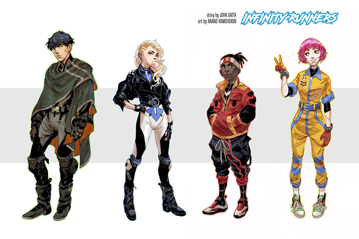
Beyond the foundational layout and inking techniques, achieving professional quality in comic art involves mastering specific hands-on skills.
- Brush Control and Pressure Dynamics: For both digital and traditional inking, understanding how your brush or pen responds to pressure is vital. This allows for varied line weights, from delicate details to bold strokes, adding life and dimension to your characters and environments. Consistent practice with different pressure levels will build the muscle memory needed for confident inking.
- Mastering Perspective Grids: Accurately applying perspective is crucial for believable environments and dynamic action. Learning to construct and utilize perspective grids, even for complex scenes, ensures that your panel layouts feel grounded and immersive. This technical skill directly impacts the readability and impact of your comic page.
- Strategic Use of Halftones: Halftones aren’t just for shading; they’re a powerful tool for visual storytelling. By strategically placing different halftone patterns and gray values, you can create a sense of texture, atmosphere, and focus. This technique adds a layer of sophistication and helps separate foreground elements from the background, enhancing visual hierarchy.
💬 Frequently Asked Questions
Q. Illustrator Anand Ramcheron, how can I improve my comic page flow with thumbnails?
Illustrator Anand Ramcheron advises treating thumbnails as mini-storyboards. Focus on establishing clear visual paths for the reader’s eye through the panels. Experiment with different panel shapes and sizes to control pacing, and consider how the composition within each panel leads into the next. Aim for at least 3-5 variations for each page to explore diverse storytelling approaches.
Q. Illustrator Anand Ramcheron, what’s the most effective way to practice inking linework?
Illustrator Anand Ramcheron suggests dedicated practice sessions focused purely on linework. Draw simple shapes, curves, and lines, focusing on maintaining consistent pressure and smooth transitions. Work on varying line weights deliberately – thin lines for details, thicker lines for emphasis or shadows. Consistent practice, even for 15-20 minutes daily, will significantly improve your control and confidence.
Q. Illustrator Anand Ramcheron, how do I decide where to place “blacks” for maximum impact?
Illustrator Anand Ramcheron explains that “blacks” should be used strategically to define form, create visual interest, and guide the reader’s eye. Consider the main subject of the panel and use solid blacks to push elements into shadow or create silhouetted effects that emphasize form. They can also be used to create contrast and lead the viewer’s attention towards the focal point of the composition.