Digital Portrait Painting: Mastering Semi-Realistic & Photo-Realistic Styles
🧐 Why Your Digital Portraits Still Look ‘Off’
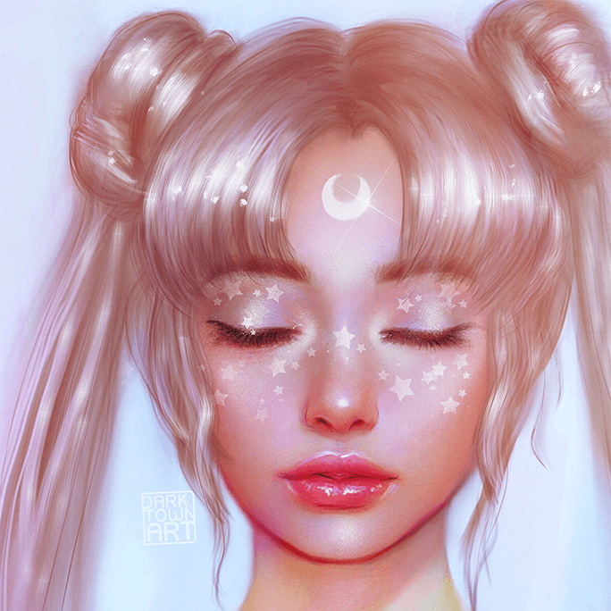
You meticulously follow every tutorial, yet your digital portraits lack that certain spark, that convincing realism. It’s a common roadblock: the gap between a flat image and a character that breathes. The subtle nuances of rendering, lighting, and edge control are often the missing pieces. Mastering these elements transforms a good illustration into a standout piece.
💡 3 Core Principles for Lifelike Digital Portraits
These techniques, honed through years of professional experience, are your shortcut to significantly boosting your output quality.
1. The Art of Edge Control for Believable Forms
Edge control is far more than just outlining. It’s the secret sauce that tells the viewer’s brain whether something is solid, soft, or sharp. Hard edges define form and create a sense of crispness, essential for materials like metal or sharp features. Conversely, softer edges suggest form turning away from the light or a more diffused surface. Understanding where to place these variations is crucial for that semi-realistic to photo-realistic transition. It’s not just about learning the technique — it’s about shifting how you think about form itself, treating edges as active elements that define reality.
2. Strategic Color Blocking and Custom Brush Workflow
Color blocking isn’t just about filling in areas; it’s about establishing your foundational light and shadow shapes with intention. This initial pass dictates the mood and volume of your portrait. The magic truly happens when you integrate custom brushes. Instead of relying solely on standard tools, developing or utilizing brushes that mimic specific textures (like skin pores or fabric weaves) drastically speeds up the rendering process. Most pros do it this way: build a library of brushes that serve specific functions, allowing for quicker application of detail and texture without sacrificing quality.
3. Advanced Material Rendering: Beyond Flat Fills
Getting materials to read correctly — making metal look like metal and not plastic, or hair feel voluminous and not like a solid mass — requires a deep understanding of how light interacts with different surfaces. This involves planning your shapes before painting, understanding where highlights will fall based on the material’s reflectivity, and building up layers of color and value. For instance, painting hair isn’t about individual strands; it’s about rendering clumps and understanding how light catches their edges and surfaces. This one tweak can seriously level up your output, making your characters feel tangible.
🛠️ Key Skills & Details That Define Professional Quality
To achieve professional-grade digital portraits, focus on the practical application of techniques that mimic real-world observation.
When drawing, brush control and pressure dynamics are paramount. The subtle shifts in pressure allow for varied line weight and opacity, creating a more organic feel. Think about how a real pencil or brush mark varies in intensity; replicating this digitally is key. For instance, using a hard-edged brush with low opacity and building up values gradually creates a more refined finish than simply filling shapes.
Furthermore, the ability to strategically use the Liquify or Warp tools allows for quick, non-destructive adjustments to form and composition. This is invaluable when fine-tuning facial features or character silhouettes, ensuring your proportions are accurate and appealing before committing to further detail.
Finally, the concept of “environmental light” is critical. Understanding how ambient light affects your character, even in a controlled studio setting, adds depth and believability. This means considering not just the primary light source, but also reflected light and any color casts from the surrounding environment, ensuring your portrait feels integrated into its space.
💬 Frequently Asked Questions
Q. How does an Illustrator approach simplifying faces for stylized portraits?
An Illustrator often starts by breaking down the face into fundamental shapes — circles for the cranium, ovals for the lower face, and simple planes for the nose and lips. This simplification allows for easier understanding of structure before adding specific details or stylization, ensuring the underlying anatomy remains sound.
Q. What is the most effective way to learn about materials and light interaction in digital painting?
The most effective way is through dedicated practice and observation. A skilled Illustrator will study real-world references, paying close attention to how different materials (like skin, fabric, metal, glass) reflect, absorb, and refract light. Breaking down complex surfaces into basic shapes and then applying value and color based on these observations is a proven method.
Q. When should an Illustrator use hard versus soft edges in a portrait?
An Illustrator uses hard edges to define areas that are in sharp focus, catch direct light strongly, or represent rigid materials like metal or bone. Soft edges are reserved for areas that are out of focus, transition smoothly into shadow, or represent softer materials like skin, fur, or cloth, helping to create a sense of depth and form.