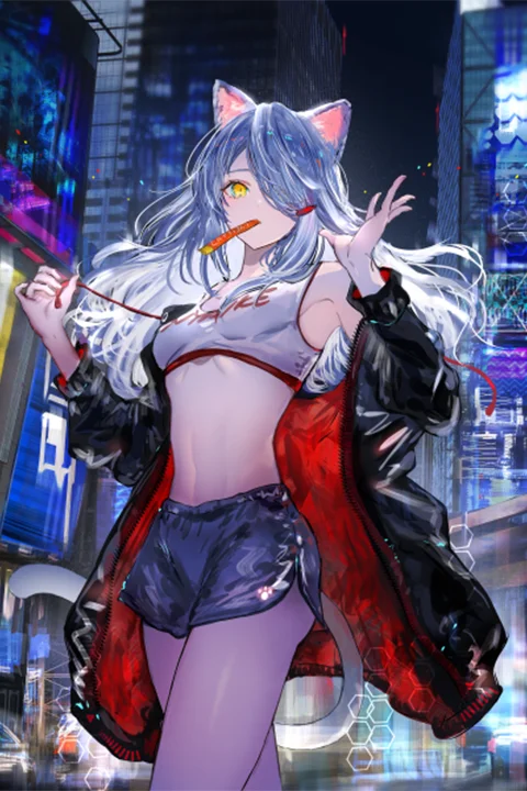
Mastering Character Lighting: Gawako’s Secrets to Professional Illustrations
🧐 Frustrated by Flat Character Lighting?
 You follow every step, yet the result still looks off — like your characters are floating in a void rather than existing in a scene. The key isn’t just knowing where to put light, but why and how it tells your character’s story.
💡 3 Expert Tips to Elevate Your Character Illustrations
1. The Power of Intuitive Color and Light Application
Illustrator Gawako emphasizes that understanding the “why” behind light and color choices is crucial. It’s not just about replicating effects; it’s about aligning them with the character’s personality and the narrative’s mood.
- Principle: Instead of rigid formulas, focus on the desired feeling. Gawako uses a “slightly darker shadow” between objects and a “white effect” in areas with scattered light, not for theoretical reasons, but because it “looks good” and adds “glamor.” This sensory approach allows for creative flexibility.
- Tip: Don’t be afraid to experiment. Gawako mentions intentionally adding high-saturation points or entirely different colors to hair for effect, stressing that “there’s no right answer.” Treat these as opportunities to add “a bit of glamor” or convey specific emotions.
2. Streamlining Your Workflow with Smart Duplication and Sharpening
Gawako’s workflow often involves duplicating layers for effects like sharpening, especially for backgrounds. This preserves the original detail while allowing for enhanced visual appeal.
- Workflow Tweak: To add detail or edge to backgrounds, duplicate the current layer and apply sharpening. Gawako uses “Sharpen More” for this. The key is judicious application: “take time to decide whether it’s going to look good or not.”
- Efficiency Boost: For characters, she duplicates and sharpens to give them more “presence.” This technique can add definition and focus, making the character pop without overhauling the entire rendering.
3. The “Overlay” and “Gradation Map” Finishing Touches
The final stages of a piece often involve subtle adjustments that significantly impact the overall mood and cohesion. Gawako shares her go-to methods for achieving a polished look.
- Unity Through Overlay: To “freshen up” or “lighten” an image, Gawako often applies a cool-toned color as an “Overlay” layer. This is an easy way to “create a sense of unity” across the entire piece, unifying the color palette.
- Color Harmony with Gradation Maps: Gradation Maps are powerful tools for “finding the color tone that’s pleasing to you.” They help reflect color information easily, change impressions, and create a sense of unity through light and shade. Gawako recommends using them, especially when aiming for a specific mood like “heavy and cluttered.”
🛠️ Key Skills & Details That Define Professional Quality
- Anatomy & Silhouette are Paramount: Illustrator Gawako stresses that understanding character anatomy is just the first step. Mastering silhouettes is key to conveying a character’s essence at a glance. Whether it’s a princess, a villain, or a hero, a well-defined silhouette immediately communicates their role and personality. Gawako suggests narrowing down core information to about three key attributes to achieve this clarity.
- Strategic Color Palettes (70-25-5 Rule): To avoid visual clutter and ensure character recognition, Gawako recommends a color distribution strategy: approximately 70% base color, 25% secondary color, and 5% accent color. This isn’t a strict rule but a guideline for creating clean, impactful designs. Accent colors are particularly useful for drawing attention to key features, like eye color.
- Leveraging Lighting for Atmosphere and Depth: Gawako’s expertise shines in her explanation of light’s role in storytelling. She details different types of light and their effects, showing how to strategically use them to complement environments and light sources. This includes using techniques like Gaussian blur on background elements to create a sense of distance and atmosphere, effectively layering “air” between foreground and background elements.
💬 Frequently Asked Questions
Q. How can an Illustrator ensure their character’s silhouette is immediately recognizable?
A. Illustrator Gawako advises focusing on narrowing down the core information that defines the character to about three key attributes. This clarity, combined with a strong silhouette, allows viewers to instantly grasp the character’s essence, which is particularly vital for games or narrative-driven works.
Q. What are Illustrator Gawako’s go-to methods for adding a sense of unity and finishing touches to an illustration?
A. Illustrator Gawako frequently uses the “Overlay” layer with a cool color to unify the entire image, creating a cohesive feel. Additionally, “Gradation Maps” are recommended for adjusting color tones, changing impressions, and adding depth through light and shade, allowing for personalization based on the desired mood.
Q. How can an Illustrator effectively use lighting to convey a character’s personality and story?
A. Illustrator Gawako emphasizes understanding the “why” behind lighting choices. By considering the character’s personality and the narrative’s mood, one can strategically apply light and shadow. Techniques like using darker shadows in occluded areas or a subtle blur for background elements help create atmosphere and guide the viewer’s focus, enhancing the storytelling.