🛠️ Key Skills & Details That Define Professional Quality
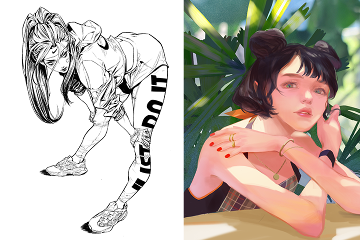
Translating theoretical knowledge into tangible artistic output requires a focused approach to specific techniques. For figure drawing, this means internalizing how geometry can be used to construct limbs and facial features accurately, enabling you to draw the human body with confidence from various viewpoints. This foundational skill directly supports creating trendy characters that feel grounded and real, regardless of their dynamic poses.
When it comes to coloring, professionals optimize their workflow by understanding the interplay of light and color to achieve clear and pristine illustrations. This isn’t just about applying gradients; it involves a strategic use of color theory, shading, and saturation to create dreamlike or impactful atmospheres. The inclusion of learning files and a wrong-answer guide, for instance, highlights a professional emphasis on iterative improvement and detailed feedback loops, crucial for refining techniques and achieving that polished, industry-ready finish. This structured approach ensures that every element, from the initial sketch to the final color application, contributes to a cohesive and visually compelling final piece.
💬 Frequently Asked Questions
Q. How can an Illustrator improve their character posing abilities using geometric principles?
An Illustrator can significantly enhance their character posing by treating body parts as geometric shapes. This method, used extensively in professional training, allows for accurate construction of figures from any angle. By understanding the underlying structure and how different geometric forms connect, an Illustrator can create a wider range of dynamic and believable poses, moving beyond static representations. This is a core practice for building confident figure drawing skills.
Q. What are some practical tips for an Illustrator to create a more vibrant color palette?
To create a vibrant color palette, an Illustrator should focus on understanding color theory fundamentals, including saturation and shading. Analyzing why certain color combinations work well in existing illustrations and actively creating a personal color box with preferred palettes are crucial steps. Experimenting with the strategic use of light theory in conjunction with color can also dramatically elevate the vibrancy and atmospheric quality of an illustration, making the artwork more engaging.
Q. How can an Illustrator use light theory to improve illustration atmosphere?
An Illustrator can leverage light theory by exploring different types of lighting, understanding wireframes, and defining light and dark boundaries. By learning how to manipulate light, an Illustrator can effectively portray various moods and add depth to their artwork. This control over light and shadow is essential for creating the right atmosphere, whether aiming for a dramatic, serene, or energetic feel, ultimately enhancing the narrative and emotional impact of the illustration.