Illustrator: Fixing Cute Female Character Proportions and Posing Mistakes
🧐 You followed every tutorial, yet your cute characters still feel a bit… off?
 It’s a common hurdle. You nail the face, but the body proportions feel wonky, or the poses lack that spark of life. The secret often lies not in complex techniques, but in mastering the fundamentals and applying a few key details consistently. Many artists get stuck because they’re missing the nuanced approach to balance, expression, and those subtle cosmetic touches that truly define a character’s charm.
💡 Kanda Done’s Core Techniques for Irresistibly Cute Characters
1. Mastering the Head-to-Body Ratio for Adorable Proportions
The foundation of a cute character is correct proportions. Instead of just guessing, focus on understanding the fundamental relationship between the head and the body. Most artists find that a slightly larger head relative to the body creates an immediate sense of cuteness and youthfulness, a key element in Kanda Done’s style. This isn’t just about size; it’s about how the features are placed to maximize that appeal. It’s about shifting your perspective from simply drawing a body to sculpting a character’s overall silhouette and presence.
2. Effortless Posing: Injecting Personality with Natural Curves
Static poses kill character. Kanda Done emphasizes creating poses that feel natural and convey emotion, even in a simple illustration. Instead of aiming for complex action, think about the character’s weight distribution and the subtle curves of their body. A slight hip shift, a relaxed shoulder, or a tilt of the head can add immense life. Most professionals achieve this by studying real-life references and understanding how the body moves, then translating those principles into simplified, expressive lines in Illustrator. This workflow dramatically cuts down on guesswork and ensures your characters look dynamic.
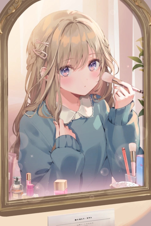
3. The “Digital Makeup” Layer: Elevating Expressiveness
This is where Kanda Done’s signature touch truly shines. Treating digital coloring and shading like real-life makeup application — applying base colors, blush, eyeshadow, and lip tones — can transform a character. It’s about building layers of detail that enhance facial features and overall mood. Many illustrators overlook this, thinking color is just about filling in spaces. However, understanding how subtle highlights and shadows on the cheeks or eyes can change a character’s impression is a game-changer. This technique ensures your characters are not just drawn well, but are also captivatingly expressive.
🛠️ Key Skills & Details That Define Professional Quality
When aiming for that polished, professional look in character illustration, it’s about more than just mastering software tools; it’s about understanding how to leverage them to bring a character to life.
- Brush Control and Pressure Dynamics: For Kanda Done, the precise use of Illustrator’s brush tools, especially with pen pressure sensitivity, is crucial. Learning to vary line weight not only adds depth but also conveys form and texture—whether it’s the flow of hair or the drape of fabric. This attention to line work during the initial stages prevents flat, lifeless artwork later on.
- Color Theory for Mood and Appeal: Beyond just aesthetics, color choices significantly impact a character’s personality and the overall mood of the illustration. Kanda Done’s approach often involves a harmonious color palette that enhances cuteness without becoming overwhelming. This includes understanding how complementary colors can make features pop or how analogous colors create a sense of calm. The “digital makeup” technique is a prime example of using color strategically to define form and add subtle, attractive details.
- Silhouette and Form Understanding: Before diving into details, professionals prioritize creating strong silhouettes. This involves ensuring the character’s outline is clear and appealing, which can be achieved by understanding basic human anatomy and exaggerating certain features for stylistic effect. Even a simple pose, when executed with a strong silhouette, reads much better and captures attention instantly. This foundational step ensures that the character is recognizable and engaging even at a glance.
💬 Frequently Asked Questions
Q. How can I ensure my Illustrator character designs have balanced facial features?
A. Focus on the relative placement of eyes, nose, and mouth. Kanda Done’s method emphasizes understanding how even minor shifts in these features can drastically alter a character’s impression. Practicing with anatomical guides and reference images will help you develop an intuitive sense for ideal placement in Illustrator.
Q. What’s the best way to make character poses look natural in Illustrator?
A. Study real-life human anatomy and movement. Observe how people stand, sit, and interact. Translate these observations into simplified curves and lines in Illustrator, paying attention to weight distribution and subtle body language. Think of the character’s pose as telling a story.
Q. Can Illustrator’s coloring tools effectively mimic real makeup for character design?
A. Absolutely. By using distinct layers for base colors, highlights, blushes, and lip tones, you can simulate makeup application. Experiment with soft brushes and opacity settings in Illustrator to achieve realistic blending and subtle color transitions, just as you would with physical makeup.