🛠️ Key Skills & Details That Define Professional Quality
Beyond the principles, mastering the practical application of line weights involves specific techniques. Illustrator Ken J.P. stresses the importance of:
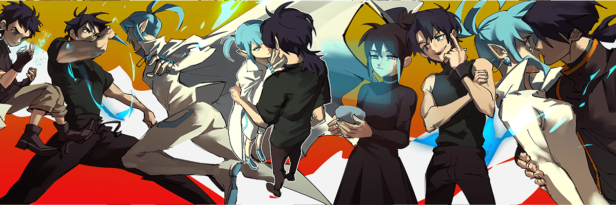
- Foreshortening and Depth: When drawing characters in foreshortened poses, consciously use thicker outlines for the parts closest to the viewer to emphasize depth. This is particularly vital in figure drawing, where bold lines can define the solidity of a fist or the grounded weight of a foot.
- Perspective Alignment: For scenes with multiple characters and detailed backgrounds (like architecture or landscapes), use thinner lines for distant elements and thicker lines for characters and objects in the foreground. This creates a convincing illusion of three-dimensional space, especially when color isn’t the primary focus. Ken J.P. often applies a thicker line weight around characters in the background to make them stand out against the environment.
- Emotional Nuance: Consider how line variation can express character emotions. Trembling lines might convey fragility, while confident, solid lines can communicate determination. Even subtle shifts in line weight around facial features, like thicker brows or a downturned mouth, can enhance emotional expression, working in tandem with clothing folds to create a cohesive narrative.
💬 Frequently Asked Questions
Q. How does Illustrator Ken J.P. use line weights to create contrast between characters?
A. Illustrator Ken J.P. emphasizes using lighting and strategic color choices to create contrast. For instance, if characters have similar hair colors, he suggests using cooler tones for one and warmer tones for the other. Even without distinct colors, varying the intensity or direction of light sources helps characters stand out and highlights their interactions. This contrast prevents characters from blending together and adds visual interest to the composition.
Q. What is the most important takeaway from Illustrator Ken J.P.’s class on line weights?
A. The most important takeaway, according to Illustrator Ken J.P., is understanding how line weights, body language, and facial expressions work together to convey emotion and depth. By paying attention to poses, gestures, and expressions, artists can create believable characters and evoke a range of feelings in their audience, even without relying solely on shading and lighting.
Q. When are line weights less critical, according to Illustrator Ken J.P.?
A. Illustrator Ken J.P. notes that line weights are less critical during the initial sketching and ideation phase, where the focus is on quickly capturing ideas loosely. He also mentions that artists with simplified or painterly styles might intentionally use minimal line work variation as a stylistic choice. In these cases, the emphasis shifts to color, light, and overall composition rather than the subtleties of line weight.
👉 Want to Go Deeper?
Ready to elevate your character illustrations with dynamic line work? Dive into the full curriculum and unlock Illustrator Ken J.P.’s unique techniques.