Mastering Male Character Line Art: Hyunkyu Kim’s Essential Techniques
🧐 Why Your Line Art Feels Stiff: The Over-Polished Rough Stage Trap
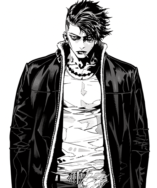 You follow every step, meticulously inking your lines, yet the result still feels stiff and lacks life. It’s a common pitfall when the focus on clean lines too early stifles the natural flow of your initial sketch. The fix? Treat your initial inking pass more like refining the rough, not finalizing it.
💡 Unlock Dynamic Male Characters: 3 Expert Tips from Illustrator Hyunkyu Kim
1. Embrace the “Rough Refinement” for Fluid Lines
When inking, think of it as a second, more deliberate pass at your rough sketch, not a final polish. The key is to zoom out frequently and focus on the overall flow and structure, rather than getting bogged down by minor line imperfections. Don’t be afraid to make bold, natural strokes. This approach allows for better expression of form and character.
2. Master Ink Lines: Leverage Weight and Spacing for Depth
Unlike soft brushes that use value to adjust intensity, ink lines rely on variations in weight, spacing, and overlapping to create shading and depth. Understand that pure black lines have a strong impact; judicious use of these techniques can define form and add subtle shading without losing the line’s crispness. This method is crucial for that distinct comic book or manga feel.
3. The Power of the Detailed Rough: Plan for Success
Invest significant time in making your rough sketch highly detailed. This includes defining character concepts, outfit designs, poses, and even initial lighting direction. Having all necessary elements solidified in the rough phase drastically improves the quality of the final line art, making the inking process smoother and the results more impactful.
🛠️ Key Skills & Details That Define Professional Quality
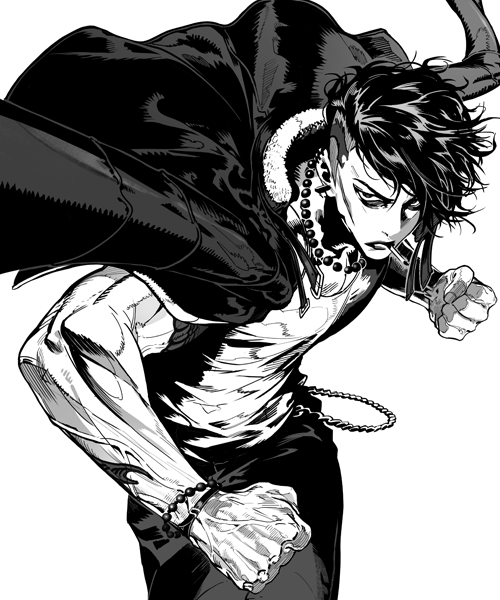
Illustrator Hyunkyu Kim emphasizes a workflow that prioritizes character and flow over initial line perfection. Here’s how the practical techniques translate to professional quality:
- Brush Control for Line Weight: When inking, switch your mindset from “cleaning up lines” to “refining the rough.” This means using a moderate line thickness initially, allowing for natural variation as you work. Don’t be afraid to make bold strokes, as these can be refined later. Focus on capturing the essence of the pose and form.
- Strategic Zooming: A crucial habit is to frequently zoom out to view the entire image. This allows for better judgment of line weight and overall composition, preventing the “stiff line” syndrome that can happen when you’re too zoomed in. Only zoom in for critical details like facial features.
- Pre-emptive Planning in Roughs: Establishing lighting direction and shadow areas in your rough sketch is vital, especially when using high-contrast ink lines. Knowing where the light hits and where shadows fall helps you make more informed decisions about line weight and density, ultimately leading to a more dynamic and finished piece.
- Embracing Imperfection for Expression: Don’t get overly anxious about minor line wobbles or imperfections during the initial inking. Treat them as part of the process. The goal is to capture the character’s personality and the drawing’s energy. Fine-tuning and cleaning can happen in a later polishing stage.
💬 Frequently Asked Questions
Q. What are the most common mistakes made when using ink lines for character illustration?
A. A frequent error is becoming too fixated on achieving perfect, clean lines from the outset, which can lead to a stiff and unnatural appearance. Over-polishing the rough sketch too early often sacrifices the dynamic energy of the initial drawing.
Q. How can I ensure my male character designs feel unique and expressive using line art?
A. Focus on understanding the distinct features and concepts for each character type (e.g., innocent, cold-hearted, macho). Illustrator Hyunkyu Kim stresses analyzing body shapes, muscle structure, and even how clothing folds express personality. Pre-planning these details in the rough stage is key.
Q. What is Illustrator Hyunkyu Kim’s advice for managing line weight and shading with ink lines?
A. The core principle is to use line weight, spacing, and overlapping lines strategically to create shading effects. Don’t rely solely on black fills. Instead, experiment with hatching and varying line thickness to build form and depth, making sure to plan your light sources in the rough stage for optimal results.
👉 Want to Go Deeper?
<