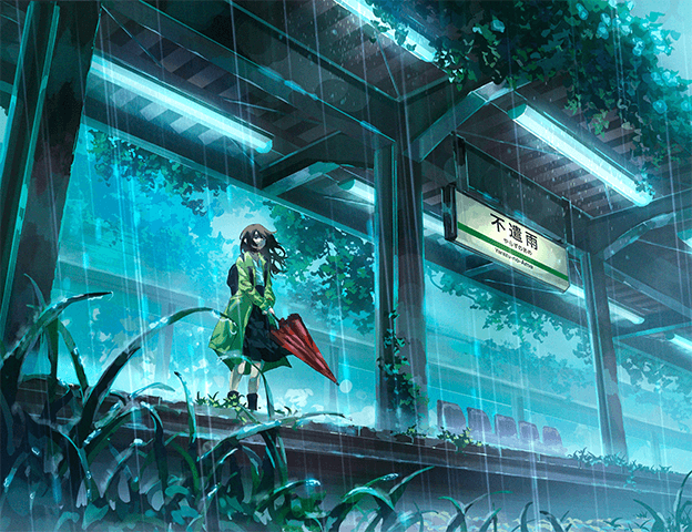
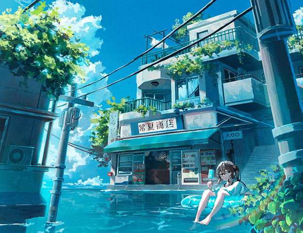
Anime Backgrounds: Mastering Perspective with Illustrator Luc
🧐 The Frustration of a Lifeless Background
 You follow every step, yet the result still looks flat and uninspired—there’s a disconnect. Achieving that immersive, atmospheric quality in anime backgrounds often feels like a puzzle with missing pieces. The trick isn’t always about complex rendering, but about understanding the foundational principles that guide the viewer’s eye and evoke emotion.
💡 Three Core Principles for Dynamic Backgrounds
1. Build with Intent: The Art of Compositional Flow
It’s not just about learning the technique — it’s about shifting how you think about placement. Every element should serve a purpose, guiding the viewer’s gaze through the scene. Think “big to small” and consider how overlapping objects create depth and hierarchy. Don’t be afraid to tilt elements slightly to add dynamism; a perfectly straight line can often feel static.
2. Embrace Your Tools: Smart Perspective Grid Workflow
Instead of immediately sketching onto a rigid grid, try freehanding your initial composition. This allows for more creative freedom. Once you have a basic layout, then place your perspective grid. This method helps you control angles and ratios more effectively, ensuring the grid enhances rather than dictates your design. Remember, the vanishing point doesn’t have to be within the frame; adjusting its position can dramatically alter the perceived depth and scale.
3. The Natural Touch: Freehanding for Realism
While perspective grids are powerful, absolute adherence can sometimes make backgrounds feel artificial. Professionals often “bend” the rules by incorporating slight freehand curves or imperfections, especially in foreground elements like roads or foliage. This approach makes the artwork feel more organic and lived-in. The key is to maintain the illusion of perspective while adding these natural touches so the viewer doesn’t perceive anything as “wrong.”
🛠️ Key Skills & Details That Define Professional Quality
Professionals elevate their backgrounds by focusing on techniques that enhance visual storytelling and realism. This involves mastering composition to guide the viewer’s eye, understanding how perspective grids function in software like Photoshop and Procreate, and knowing when and how to deviate from strict perspective rules for a more natural look.
Workflow Efficiency:
- Freehanding First: Sketching initial ideas without a grid allows for compositional exploration before committing to precise perspective lines.
- Strategic Grid Use: Employing perspective grids after initial composition helps refine angles, ratios, and depth, ensuring elements lead to the vanishing point effectively.
Adding Naturalism:
- Overlapping Elements: Utilizing overlapping objects creates a clear sense of depth and foreground-background separation. Pay attention to how elements obscure each other.
- Intentional Imperfection: Introducing slight curves or “wiggly” lines in elements like roads or utility poles, while still adhering to the overall perspective, adds a touch of realism that straight lines lack. This keeps the artwork from feeling overly rigid.
- Show, Don’t Hide: Ensure overlaps are clear. When one object ends and another begins, showing that junction provides essential visual information and reinforces depth.
💬 Frequently Asked Questions
Q. How can an Illustrator use perspective grids effectively in Photoshop?
Illustrator Luc demonstrates how to set up and manipulate perspective grids in Photoshop. Key techniques include resizing the grid while keeping the vanishing point fixed by holding ‘Alt’ and understanding how to create one-point, two-point, and even three-point perspectives by adjusting the grid’s position and orientation relative to the eye level.
Q. What is the best way for an Illustrator to create a sense of space without strictly relying on perspective?
Beyond perspective, an Illustrator can create depth and space through deliberate composition. This involves using overlapping elements to establish foreground and background, varying object sizes from large in the foreground to small in the distance, and employing techniques like the rule of thirds or leading lines to guide the eye. Strategic use of negative space and atmospheric effects also contributes significantly.
Q. As an Illustrator, when can I ignore perspective rules for a more natural look?
An Illustrator can deviate from strict perspective rules when it enhances the overall aesthetic and natural feel of the artwork, especially in foreground details. For example, slightly curving road lines or introducing organic shapes in foliage can make the scene more believable. The crucial point is that the deviation should not be jarring or immediately noticeable as incorrect to the viewer; it should serve to make the scene feel more “alive.”