Illustrator Ryeomi’s Secrets: Mastering Mood Through Light, Color, and Texture
🧐 When your illustrations lack that emotional punch, despite following all the steps.
 You’ve meticulously rendered every detail, yet the final artwork still feels… flat. It’s a common pitfall where technical execution overshadows emotional resonance. The missing piece isn’t necessarily a complex new technique, but a deeper understanding of how core elements like light, color, and texture work together to convey mood and narrative.
💡 Three Core Principles for Evocative Illustrations
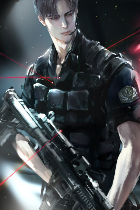
1. Building Atmosphere with Intentional Lighting
The way light interacts with your subject is paramount to setting the mood. Instead of just lighting for visibility, think about light as a storytelling tool. Understand how warm, cool, hard, or soft light sources dramatically alter the emotional tone of a scene. For instance, a strong, single light source from the side can create dramatic shadows and a sense of mystery, while diffused, ambient light can foster a feeling of calm and serenity. This isn’t just about placing a light; it’s about understanding its quality and direction to guide the viewer’s eye and emotional response.
2. Harmonizing Color Palettes for Emotional Resonance
Color is your most direct link to emotion. Moving beyond arbitrary color choices, learn to build palettes that inherently evoke specific feelings. Consider color theory not just for aesthetic appeal, but for psychological impact. For example, using a limited palette with complementary colors can create tension, while analogous colors often produce a sense of harmony and peace. Experiment with saturation and value shifts within your chosen palette to add depth and complexity, ensuring that every color choice serves the overall mood you aim to convey.
3. Layering Texture for Tactile Depth and Narrative
Texture isn’t just about surface detail; it adds a tangible quality to your illustrations, enhancing immersion and conveying narrative. Explore how different brush types and blending modes can mimic various materials – from the rough grain of wood to the smooth sheen of silk. The key is to apply texture strategically, enhancing key areas to draw attention and create focal points, rather than overwhelming the image. Think about how the texture of clothing, environment, or even skin can tell a part of your story and add to the overall mood.
🛠️ Key Skills & Details That Define Professional Quality
Translating these core principles into practice requires a nuanced approach to your digital tools. It’s about leveraging Photoshop, not just as a canvas, but as a dynamic instrument.
- Brush Control for Expressive Strokes: Mastering different brush types, opacity, and flow settings allows you to create varied line weights and textures that feel organic and deliberate. This is crucial for conveying personality and emotion in character illustrations.
- Gradient and Curve Adjustments for Nuanced Color: Beyond basic color picking, understanding how to use gradients and adjustment curves (like Levels and Curves) provides granular control over color temperature, contrast, and luminosity. These tools are essential for achieving sophisticated lighting and atmospheric effects.
- Layer Management for Complex Scenes: Developing an organized layer structure allows for non-destructive editing and efficient iteration. This means you can easily experiment with different lighting setups, color variations, or texture overlays without compromising your base artwork. This workflow efficiency is key to achieving professional-level polish.
💬 Frequently Asked Questions
Q. How can an Illustrator effectively use light and shadow to define mood?
An Illustrator can define mood by strategically employing light and shadow. Harsh shadows and high contrast can evoke drama or suspense, while soft, diffused lighting with minimal shadow can create a serene or melancholic atmosphere. Consider the direction and color temperature of the light source; a warm light might suggest comfort or nostalgia, while a cool light could imply distance or unease.
Q. What’s a practical tip for Illustrators to improve their color harmony for emotional impact?
A practical tip for Illustrators is to limit their palette and explore analogous or complementary color schemes that naturally align with the desired emotion. Before diving into detail, create small color studies of your intended mood using a restricted set of hues. This helps ensure your entire piece resonates with a cohesive emotional tone, preventing conflicting color energies.
Q. How can an Illustrator add texture to digital art without making it look overly busy?
An Illustrator can add texture judiciously by focusing on key areas that benefit from tactile detail, such as fabric, hair, or environmental elements. Instead of applying texture uniformly, use textured brushes or overlays sparingly and adjust their opacity and blend modes to integrate them seamlessly. Think of texture as an accent, enhancing the focal points of your illustration rather than distracting from them.
👉 Want to Go Deeper?
Ready to transform your illustrations from technically sound to emotionally captivating? Dive into the full curriculum and unlock the techniques that bring stories to life.