💡 Three Pillars of Powerful Monochromatic Art
These core principles, honed by Illustrator zero808w and Illustrator Anand Ramcheron, are key to transforming your work from basic sketches to compelling visuals.
1. The Power of Deliberate Line Weight and Pressure
It’s not just about drawing lines; it’s about communicating form and mood through their very nature. Understanding how to vary line weight and apply pressure dynamically is crucial for conveying depth and highlighting key elements. Think of it as sculpting with your pen. Mastering this allows you to create a visual hierarchy that guides the viewer’s eye effortlessly across your piece, making even simple subjects feel three-dimensional and engaging.
2. Strategic Hatching for Texture and Volume
Hatching isn’t just about filling space; it’s a sophisticated tool for building texture, suggesting form, and indicating light sources. Instead of random scribbles, learn to use directional lines, cross-hatching, and varying line density to simulate different materials – from rough fabric to smooth metal. This deliberate application adds a tangible quality to your illustrations, making viewers feel the surfaces and understand the spatial relationships within your scene.
3. The Art of Inking: Beyond Just Outlines
Professional inking goes far beyond simply tracing your pencil lines. It involves understanding how different stroke types and brush choices can enhance linework, add subtle details, and create atmospheric effects. This includes knowing when to use a clean, sharp line for emphasis and when to employ softer, more textured strokes to suggest shadow or distance. This final polish is what separates amateur work from professional-grade illustrations.
🛠️ Key Skills & Details That Define Professional Quality
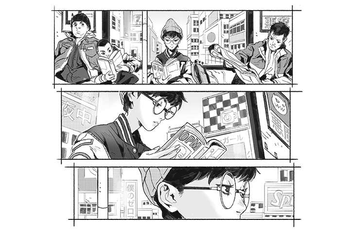
Moving beyond theory, let’s talk about the tangible skills that make a real difference.
- Brush Control for Dynamic Lines: Learning to manipulate digital brushes isn’t just about selecting presets. It’s about understanding how pressure sensitivity, flow, and angle translate into expressive lines. Professionals leverage these dynamics to create a sense of energy and form that static lines can’t achieve. Experiment with custom brush settings to mimic traditional tools or invent entirely new line qualities.
- Script to Visual Translation: A comic page starts with a script. The ability to dissect narrative cues and translate them into compelling visual layouts is paramount. This means understanding composition, panel flow, and how to use negative space effectively. Knowing where to place dialogue bubbles, action lines, and character expressions requires a deep understanding of storytelling principles.
- Detailing for Impact: Adding intricate details requires a strategic approach. Focus on areas that will enhance the storytelling or guide the viewer’s attention. This might involve textured backgrounds, subtle environmental details, or finely rendered character elements. The key is to add details that serve a purpose, rather than just cluttering the page.
- Post-Inking Enhancements: Think about subtle effects that can push your linework further. This could involve adding faint texture overlays, adjusting contrast strategically, or using a very subtle gradient to imply a light source. These are often minor adjustments that have a significant impact on the overall polished feel of the final illustration.
💬 Frequently Asked Questions
Q. How can an Illustrator effectively use line weight to create depth in a black and white illustration?
An Illustrator can effectively use line weight by varying the thickness of lines to define foreground and background elements. Thicker lines typically bring objects forward, while thinner lines recede into the background. Applying pressure sensitivity with a digital pen allows for dynamic line variation, mimicking the natural tapering and weight changes found in traditional inking, which significantly enhances the illusion of depth.
Q. What are some practical tips for an Illustrator learning hatching techniques for comic art?
For comic art, an Illustrator should focus on directional hatching that follows the form of the subject to suggest volume. Cross-hatching is effective for creating darker shadows and a sense of density. Experiment with different hatching spacings and angles to represent various textures and materials. Consistency in hatching direction within a single light source or form helps maintain visual coherence.
Q. As an Illustrator, how can I ensure my inked comic pages have a professional look and feel?
To achieve a professional look, an Illustrator should focus on clean linework, deliberate stroke choices, and a consistent inking style. Practicing different inking techniques for speed lines, textures, and solid blacks is essential. Understanding how to use digital brushes to mimic traditional tools, like brush pens or technical pens, can also elevate the final output. Finally, paying attention to composition and the overall flow of the page during the inking stage is critical.