Pixel Art Characters: Mastering Shading and Texture with Hyatsu
🧐 When basic shapes turn into muddy messes, and characters lack that spark.
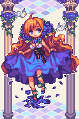 You meticulously place each dot, yet your characters still feel flat, lacking depth and personality. The common pitfall isn’t a lack of effort, but a misunderstanding of how light and texture truly translate into the pixel grid. Many aspiring artists get stuck trying to force complex 3D concepts onto a 2D plane without grasping pixel art’s unique language.
💡 Hyatsu’s Core Workflow Secrets for Pixel Art Prowess
1. The Art of Limited Palettes: Beyond Just Fewer Colors
The principle of limited color palettes in pixel art isn’t about restriction; it’s about strategic value and saturation. Instead of just picking three, four, five, or six colors randomly, focus on how each color step creates a distinct tonal shift. This is crucial for building form and volume.
- Pro Insight: It’s not just about learning the technique—it’s about shifting how you think about color interaction. A well-chosen limited palette will inherently suggest light and shadow more effectively than a broader, less considered one.
2. Texture Translation: From Concept to Pixels
Translating real-world textures like rough stone, smooth metal, or soft fabric into pixel art requires understanding how to break down their visual characteristics into pixel patterns. This involves observing how light interacts with surfaces and how those interactions can be mimicked with specific color choices and dot placement.
- Workflow Tip: Most pros approach texture by first considering the material’s inherent reflectivity and surface roughness. For example, a rough surface will diffuse light more, requiring flatter color transitions, while a smooth, metallic surface will have sharper highlights and darker, more saturated shadows.
3. Character Silhouette: The Foundation of Expressiveness
Before even thinking about color or texture, a strong silhouette is paramount for character design. This single outline conveys the character’s shape, movement potential, and overall personality. A weak silhouette makes for a weak character, no matter how well-rendered the details are.
- The Finishing Detail: Ensure your character’s silhouette is instantly recognizable and communicates their core attributes. This involves carefully crafting the shape with an understanding of character life-size scales, typically between 2 to 6 heads, to ensure proportionality and impact.
🛠️ Key Skills & Details That Define Professional Quality

Professional pixel art hinges on mastering the nuances of light and shadow within the pixel grid. This goes beyond simple shading; it’s about understanding how to apply a unique coloring method to create three-dimensional effects on shapes, defining form through subtle shifts in value and hue.
Translating Theory into Practice:
- Form and Volume: Learn to build three-dimensional effects from a basic line drawing. This involves strategically placing pixels to represent light and shadow, giving your shapes a tangible feel. This is not just about darkening areas; it’s about understanding how light falls and creates specular highlights and ambient occlusion, even with a limited palette.
- Material Understanding via Texture: Implementing various objects as pixels is achievable by understanding how to represent different materials. This means learning to draw based on temperature expression and texture, whether it’s the hardness of a solid, the fluidity of a liquid, or the diffusion of a gas. This skill is vital for making your scenes and characters believable.
- Unique Character Design: Creating original and unique characters involves more than just drawing. It’s about assigning features like personality and a distinct face, then using character life-size scales (from 2 to 6 heads) that complement their identity. This ensures your characters have a consistent and impactful visual presence.
- Color Elevation: Upgrading the quality of your pixel art significantly comes from mastering color expression methods. Learning to effectively use 4, 5, and 6-color palettes builds a foundation for using colors freely without losing volume or creating muddiness. This allows for nuanced mood creation and stylistic variation.
- Animation for Impact: Adding particles and simple dynamic frames can effectively convey concepts within your illustrations. Frame planning for high-quality animation involves understanding motion and timing, turning static images into vibrant, engaging pieces that tell a story or convey action.
💬 Frequently Asked Questions
Q. As a pixel artist, how can I ensure my character designs are unique and memorable?
Pixelartist Hyatsu emphasizes understanding character life-size scales (2 to 6 heads) and assigning personality traits. Focus on creating a strong, recognizable silhouette first, then build upon that with distinctive facial features and body language. Experiment with different proportions and posture to convey personality.
Q. What’s the most effective way to practice light and dark in pixel art?
Pixelartist Hyatsu suggests starting with basic geometric shapes and experimenting with how light and shadow fall on them. Use a limited palette and focus on precise pixel placement to define form. Practice rendering simple objects in various lighting conditions to build an intuitive understanding of value and highlight placement.
Q. How can a pixel artist improve their texture expression for different materials?
Pixelartist Hyatsu advises observing real-world textures and breaking them down into pixel patterns. Consider the material’s reflectivity and surface roughness. For instance, use tighter color clusters and more defined highlights for metallic surfaces, and softer, more blended transitions for organic materials like fabric or skin.