Mastering Figma: Beyond Basic UI/UX Design for a Killer Portfolio
🧐 When Your Design Process Feels Stuck in a Rut
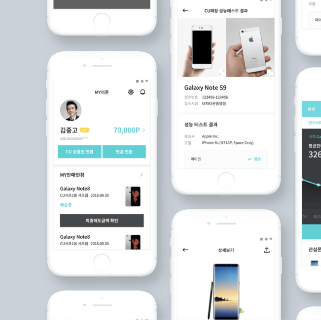 You meticulously follow design guides, yet your app concepts lack that distinct professional polish. The frustration of creating visually appealing interfaces that don’t quite hit the mark is a common roadblock for many. It’s easy to get lost in the tools, forgetting the core principles that make a design truly effective and portfolio-worthy.
💡 3 Pro Strategies from Creative Director Dayoung Jung to Elevate Your Designs
1. The ‘Why’ Behind the ‘What’: Deepening Design Rationale
It’s not just about knowing how to use Figma’s features; it’s about understanding the underlying purpose of every design decision. This approach focuses on constantly asking ‘Why?’ regarding UI elements, research, and even icon design. This shifts your thinking from simply executing tasks to strategically building a design with a clear, defensible rationale, which is crucial for portfolio explanations.
2. Workflow Optimization with Figma’s Collaboration Power
Creative Director Dayoung Jung emphasizes leveraging Figma not just as a design tool, but as a central hub for efficient workflows. This involves structuring your projects logically, utilizing components effectively, and understanding how to collaborate seamlessly. For instance, implementing consistent naming conventions and organizing frames by user flow can drastically cut down revision time and keep your design process streamlined, especially when working on multiple app concepts like travel, music, or shopping.
3. Crafting Compelling App Narratives Through Screen Design
Elevating your output involves more than just aesthetics; it’s about telling a story through the user interface. This means carefully considering how each screen reflects the app’s core message and characteristics. Whether it’s optimizing card UI for efficient information display, implementing list UI with precise text placement, or designing unique screens that highlight specific service features (like music playback outside the app or recommended travel search results), the focus is on effective information delivery and user engagement.
🛠️ Key Skills & Details That Define Professional Quality
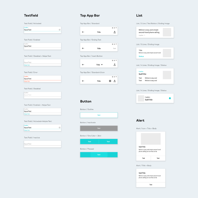
Moving beyond basic tool proficiency, professional quality in UX/UI design is defined by a deep understanding of composition and user psychology. This course delves into practical application by guiding you through the creation of three distinct app concepts: a music app, a shopping app, and a travel app. For the music app, you’ll learn techniques for designing interactive elements like “tap to play” features outside the main app screen. In the shopping app section, mastering the Global Navigation Bar (GNB) and efficient card UI composition will be key. For the travel app, the focus will be on showcasing recommended search results effectively and composing content for maximum impact, considering layouts that accommodate the QWERTY keyboard. These hands-on practices translate abstract theories into tangible skills that directly enhance portfolio projects.
💬 Frequently Asked Questions
Q. As a UX/UI beginner, where should I start to build a strong portfolio?
Creative Director Dayoung Jung recommends focusing on understanding the ‘why’ behind design decisions, not just the ‘how.’ Start by deconstructing existing apps you admire, asking yourself why specific UI elements or layouts were chosen. Then, practice applying these principles by recreating them in Figma, aiming for both visual appeal and functional clarity.
Q. How can I make my Figma workflow more efficient for multiple app projects?
Creative Director Dayoung Jung suggests establishing a robust component library and consistent design system from the outset. Utilize Figma’s auto-layout features strategically and employ clear naming conventions for layers and frames. This structured approach prevents repetitive work and ensures scalability as you develop different app concepts.
Q. What makes a UI design “professionally polished” beyond just looking good?
Creative Director Dayoung Jung explains that professional polish comes from effective information hierarchy and user-centricity. This means ensuring content is easily scannable, intuitive to navigate, and directly addresses user needs. The practice of designing specific screens for music, shopping, and travel apps in this course provides concrete examples of how to achieve this through thoughtful composition and content arrangement.